Contact Form

Name

Email *

Message *

Tuesday, February 27, 2018

Oasis Idea Weekly - Prom Flowers

February 27, 2018
How to attach prom flowers?

We used to tape and wire boutonnieres and corsages. Now we glue.

Why glue? Which glue(s) to use? 

And what should you do—and not do—to get the most from glue?
Glue is lighter than wire or tape—and your prom and other customers are more likely to wear and enjoy wrist corsages and other structures that are lighter.

Once you learn how to glue, it is usually faster than wiring and taping, especially with the right glue choices. In addition, some designers report that gluing is easier on the hands.

What works for securing fresh flowers and decorative materials in prom designs also works for party, homecoming, wedding and special occasion floral arrangements.

To get gluing tips and techniques and see a dozen bout and corsage design photos, click the image above or green button below.
You can now comment on IDEA Weekly blogs
You can add your comments to IDEA Weekly blogs. The comment area is at the bottom of the blog page. Comments are reviewed before being posted live. We look forward to hearing from you!
This Week's Floral Video IDEA
See prom gluing tips in action designing fast fun bouts
See how Smithers-Oasis Design Director Sharon McGukin uses cold glue and adhesive strips to create fun and fast boutonnieres in this 2:58 video. 
Every OASIS Floral Products product in detail—and more!
Oasisfloralproducts.com has the complete information you need on every available OASIS Floral Products product including sizes and colors. You'll all find floral recipes, how-to videos, design ideas and inspiration. If you have questions, ideas or concerns and for order support, contact customer service at 1-800-321-8286 or support@oasisfloral.us.
Christina Burton-Fox AIFD floral artist & instructor

Guide on How to Design a Stunning Logo by Wix.com

 Web Design \ FEB 27th 2018

Step-by-Step Guide: How to Design a Stunning Logo for Your Business

The prominent presence of a logo for any business is undeniable. As the heart of your branding efforts, your logo should represent the essence of your brand’s personality.
It’s a crucial element to the already stunning website you’ve created for your biz. If the panic of your less-than-average drawing skills has already set in, fear not! The great news is: you don’t need to be a designer or break the bank in order to achieve a visual mark that’s eye-catching, memorable and unique.
We’ve compiled an ‘all you ever need to know about designing your own logo’ guide that will cover the importance of choosing the right colors and fonts, some best practices and an introduction to the ultimate online logo maker. Ready? Here are the steps you need to take in order to design a logo that truly represents your brand.
  1. Select the best logo maker in town

    As a small business owner, we know your time is valuable and limited. When looking to design a logo, you want an intuitive tool that’s easy to use and delivers impressive results. You may be surprised (and relieved) to know that creating a logo by yourself is much easier than you think. The Logo Maker is what Wix is for websites: a sophisticated and complete, yet easy-to-use tool to design your very own logo. Best of all, no design skills needed here! The tool will start by asking you a few questions: the name of your brand, your industry and the adjectives that describe your overall feel. The powerful algorithm will automatically create a selection of variations of what your future logo might look like. Pick your favorite and get ready to customize. From the fonts to the icon, you can switch up everything, to make your little gem suit your brand to a T. Voilà! In record time, you’re able to imagine, personalize and download a logo that tells your brand, and that you can immediately use across all of your marketing efforts (website, social media channels, business cards, watermarks and more).
    Wix Logo Maker
  2. Understand what makes a good logo

    Now that you’ve selected a compelling platform, it’s important to understand what a great logo is comprised of. There are a few key principles you should take into consideration before designing your masterpiece. By definition, it needs to be:
    • Simple: The phrase, “less is more” has never been more fitting. On top of improving its versatility (see the next point below), the less complicated your logo is, the easier it is to memorize.
    • Versatile: You’ll want a logo that looks good no matter where it’s placed. If your baby only looks great on big screens, but is impossible to read on a small printed piece of paper, you’ve probably missed the point.
    • Timeless: Naturally, with time, you’ll need to spruce things up a bit (Doesn’t everyone need a bit of that?), but your aim should be to design a logo as if it were your last. Always ask yourself: “Will this still look good in 10 years?” before making your logo.
    • Appropriate: Your logo doesn’t have to necessarily show exactly what your biz does or sells. Nevertheless, it should somehow appeal to your target audience. Understanding who that crowd is takes some research, but that valuable information will ensure your logo “talks” to the right people.
  3. Stay true to your brand

    Keep in mind that, at its core, a good logo should accurately represent your brand. Think of it as your visual signature, the most important piece of artwork that will reflect and embody your business. In some cases, when it’s particularly well-done, your customers might even identify your logo quicker than your business’ name! Two (crucial) aspects: first, you certainly don’t want to rush the conceptualization part. Take all the time you need to understand what is your brand’s identity and its visual language (colors, fonts, atmosphere, etc.), in order to create something that is distinctively yours – and only yours, as even the slightest resemblance with another company can have disastrous effects on your branding.
    Second: good branding requires consistency. The logo you design should be found across all of your marketing efforts, online (website, social media, email signature, etc.) as well as offline (brochures, business cards, articles in magazines, etc.). Seeing the same logo in many places will naturally help your customers grow a feeling of familiarity – and thus, of proximity, with your brand. On the opposite side, using multiple versions of a logo only creates confusion and results in a lack of identity.
  4. Find the right inspiration

    Since your logo will be popping up in all sorts of places, it’s crucial that it stands out and demands attention at all times. One way to achieve this is by looking at the most recent logo trends. For example, 2018 can definitely be described as the year of the bold. The trends lined up include creative typography and the use of bright and bold colors, all things that you can inject into your logo. Knowledge is power right? So make sure you’re up to date with what’s hot and what’s not.
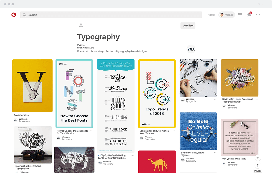
    Since inspiration is all around, don’t limit your exploration to only logo-related ideas. Pinterest, for example, is bursting with fresh creative palettestypography and layouts. The Wix blog is your daily source of valuable and varied articles that are sure to give you a creative boost. From our gorgeous template examples to our impressive collection of over 3,000 Vector Art illustrations, we’re almost certain something will spark off your creativity.
  5. Find the right inspiration: typography
  6. Put your name in the spotlight

    There are two main categories of logos. The first one is known as iconic (or symbolic), as it relies solely on a graphic. Because it doesn’t tell the name of the brand, it’s mostly used by a limited number of major companies, who already have a strong history and identity (You’re picturing an apple with a piece that’s already been bitten out – right?). As a small or medium-sized business, it’s highly recommended to go for the second category: the logotype. This one still uses a graphic, but also adds the brand’s name to it. Since it’s straight to the point and literally holds your name, there’s little room for confusion.
    Craving more text? On top of your brand’s name, you may want to add a tagline to your logo. It usually comes in the shape of a short, catchy phrase that describes a behaviour, product or feeling. A popular example we all know is from McDonald’s: “I’m lovin’ it”. To tagline, or not to tagline, that is the question. Some taglines are catchy (we know you sang “I’m lovin’ it”) and will remain with people for years to come. On the flip side, this extra line can complicate things unnecessarily. So only go for this option if it really gives more information, or offers a deeper understanding of your brand.
  7. Pick the right fonts

    Typography literally has a lot to say, that’s why there are a couple of things to consider when it comes to choosing the right fonts for your logo. In short, keep it simple. It’s a fine art to balance between a font that’s readable as well as unique and appealing. Of course, go for something beautiful, but never compromise on the legibility of your text – this should be your number one focus. A quick way to make sure your text is serving its purpose is to test your logo out on your friends. Have them read it from a number of different devices in a varied amount of sizes. Use their feedback and make adjustments accordingly.
    When it comes down to how many fonts to use, we highly recommend one (and only one) for your brand’s name, and a different one for your tagline (if you choose to add one). The most important thing is that the two fonts live in harmony within your logo. If you need a bit of extra help in this department, FontPair to the rescue! Like the name suggests, it will show you the font combinations that work well together when mixed.
  8. Wix: Pick the right fonts
  9. Choose your graphic

    Just like an image, a graphic is worth a thousand words. It’s actually the central element of your logo, and usually the part that your customers’ eyes will naturally be drawn to. If you have a clear product or service (like a photographer) find a visual that represents your activity (example: a camera) and use it as your icon. If your business is more abstract or doesn’t come with a specific product or related tool, you can use geometric shapes and lines to create a visually appealing graphic. Luckily for you, there are thousands of engaging icons available for free in the Wix Logo Maker.
    Once you’ve find the right icon, play with its size so that it complements your name (and tagline). You want to find the right balance between all the different elements of your logo, so that you end up with a harmonious final result.
  10. Play with colors

    The use of color within a logo (no matter how basic) is a carefully thought-through process. Why? Because believe it or not, colors have the ability to affect and evoke specific emotions within people. Studieshave shown that “color is a huge factor of brand recognition. A signature color can increase brand recognition by 80%”. For example, the color red evokes emotions of excitement and youthfulness. Once you know that you can understand that a brand like Coca-Cola didn’t really just pick this color by accident. Ensure that the colors you select are sending out the right message through your logo. To help you out, Wix’s Logo Maker will automatically suggests an array of precombined color palettes that you can easily apply to your logo.
    Ready to bring your brand to life? Try the Wix Logo Maker now!
Taira Sabo
By Taira Sabo
Community and Social Media Manager, Wix About the Wix Blog

Christina Burton-Fox AIFD floral artist & instructor

Pantone Hitting the Playground Colors

PANTONE Color Institute

Hitting the Playground

LAURIE PRESSMAN

Pantone Color Institute
February 26, 2018

Play has been a growing preoccupation for some time. In our previous issue, VIEWPOINT COLOUR #02: Sanctuary, we talked about Playful Release and the emergence of a design and color direction focusing in on pure enjoyment. Play remains a respite and a route to conviviality and joy, but it is also the foundation of invention. As such, we continue to see the desire for interaction and engagement reigning over passivity and uninhibited expression, where playful attitudes are embraced with enthusiasm across design.
image-Hitting the Playground
With no sign of the bold aesthetic disappearing, designers are drawing on surrealist and Dada influences to create for pure joy and happiness. Extrovert and avant-garde design invites users to determine purposes – if there are any at all – for themselves, as form leads function and art for art’s sake sees renewed appeal. Interactive installations encourage visitors to build their own creations and products promote a playful sense of interactivity, inviting users to make their own compositions, customizing pieces and parts to create vastly different outcomes.
image-Hitting the Playground
Excerpted with permission from VIEWPOINT COLOUR Issue 03 - The Play Issue.

Christina Burton-Fox AIFD floral artist & instructor